Professional Photography
|
|
Photo Composition Tip #3
Simplicity - "Less is More" Article and Photography by Stephen Kristof Staff Writer/Photographer © 2012, FreePhotoCourse.com; all rights reserved Our first tutorial on photo composition explained how to avoid clutter, such as unnecessary content and distracting elements, in order to end-up with a less confusing and more attractive picture. We moved on to the idea of "negative space" in the second tutorial. As you progress through the various aspects of photographic composition, you'll start to realize that once the budding photographer learns about his or her camera and conquers things like manual exposure, there's much more to learn in order to create the kind of stunning photographs that professionals produce rather easily. It's all about knowing what things make for interesting subjects and how to best frame them in the camera's viewfinder. This time around, I'm going to talk about the next logical step in photo composition; a concept photographers call "simplicity". It's about your choice of subject and how much of it to include, as well as how you choose to arrange it in the frame. This third concept completes a trinity of sorts: #1 - Avoiding Clutter; #2 - Negative Space; and, #3 - Simplicity. They're all very much related but just a bit different. Most novice and intermediate photographers make the common mistake of thinking that if one thing looks neat and interesting in a photo, then two or more related things will be even more interesting. But when it comes to the still photo, this kind of thinking, although all too common, is not correct. The advice is simple and I have a couple of easy-to-remember acronyms for it: OTO - One Thing Only
and LIM - Less Is More Here's a great idea that has worked well for me. Using a bold marker, write the acronyms OTO and LIM on a tiny piece of paper or card stock and put it somewhere on your camera or gear, where you'll be likely to see it whenever you are framing a picture. (Make sure you avoid covering any part of the view screen, hot shoe or controls - look for a smooth area with nothing else on it. If you choose to use some form of glue or label, do so at your own risk because it could damage your camera or its surface!) Seeing these acronyms will be a constant reminder to make sure that you are not falling into the 'repetitive content' trap that can dilute the impact that a single item can generate. |
|
Hopefully the images below don't make you too hungry, but they make a good starting point for the visual exploration of this simplicity concept. The pictures are quite similar and everything in the picture on the left appears to belong. The glass filled with a beverage, the entire plate and the placemat are all related, but are they all necessary? As a professional commercial image, the one on the left is a bit confusing. What is being sold or featured here? Is it a lunch, a table setting, the dinnerware or the beverage? It appears to feature the whole idea rather than the hot dog. The picture on the right very clearly features the hot dog and could be used effectively in any type of ad for the product, whether the hot dog is on sale in a grocery flyer or being sold in a casual food joint.
How does a photographer change the view to include less "stuff" in the frame? Sometimes the photographer needs to physically remove certain subject matter from the scene, get a closer view, move the camera laterally or horizontally, get a different perspective, or move around the subject and photograph it from a completely different angle. Another method is to use extremely short depth of field in order to remove detail from the background.
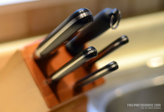
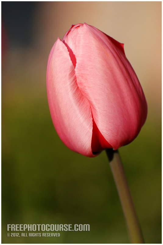
In the image below (and in the picture of the single tulip shown below it), you can see how I used short depth of field to create a pleasing bokeh in the background. The butcher block, the kitchen tile backsplash and the sink don't show any detail and that forces the eye to focus 100% of the attention on the knives (the subject of the photo). Just imagine this picture blown-up and professionally framed, hung on a wall in a trendy restaurant as part of a photo art theme featuring kitchen and cooking-related subjects.
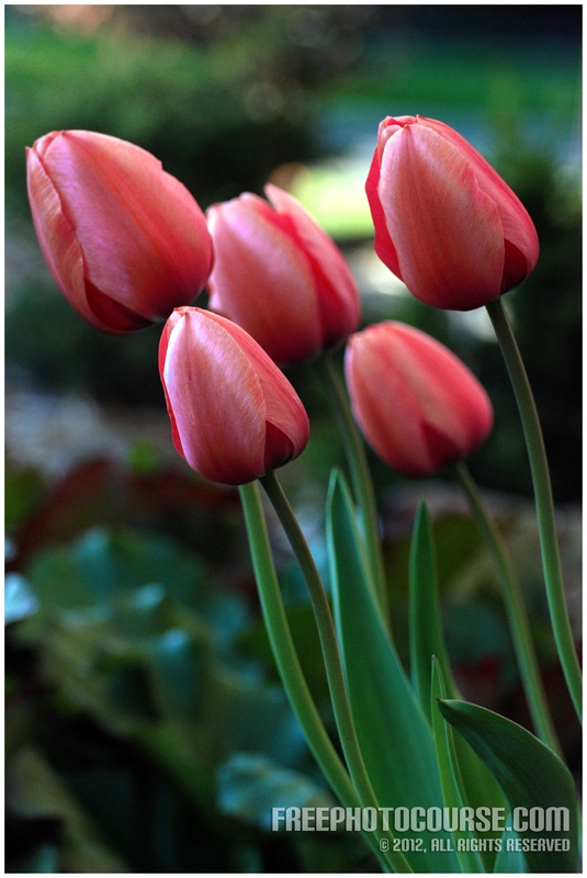
Let's get away from the food theme, because it's starting to make me hungry! The tulip pictures below provide a striking example of just how easy it is to apply the OTO or LIM strategy...and just how effectively it improves the picture. There's no denying that the image with the single tulip has a greater overall impact and 'feel' than the one with the five tulips. Imagine a scenario in which an editor for a greeting card company reviews each of these images for potential use on the front of a new card. Which one do you think she or he will select?
|
Although the composition of the photo on the right is rather symmetrical and not something that I'd usually recommend, occasionally it can be a positive compositional attribute. This is one such instance and it's supported by the absolute symmetry of the leaf itself. The bilateral or symmetrical veins in the leaf support a centered placement in the frame. In terms of the simplicity factor, it's obvious with the picture above on the left that, although they are visually related, there are too many leaves. Some are back-lit, while others are shadowed, and some are focused, while others are blurry. The picture on the right is a clear winner because of the simplicity.
|
Alas, like everything in life, composition rules have exceptions too! The picture on the left is one such example. Using the same logic applied previously in this article, one might be tempted to think that this scene is too busy. Indeed, it has multiple columns, spires, ornamental concrete, dormers, shutters and windows. There's even a bit of tree branch thrown-in on the top left. Yet, in spite of all of the various repetitive elements, this particular subject seems to be best framed in a way that includes all of this stuff. Not only do all of these related elements help to provide the original context, they also come together in this particular perspective, in a way that is very attractive. Look at the negative space and how the spires rhythmically pierce it. It's an awesome example of good composition in which several related objects can sometimes be successfully arranged in the same frame. Singling-out the one spire as shown on the right, results in a rather bland and meaningless image that's not exactly artistic. The other thing that makes the left picture the winner between the two, is the interesting perspective that creates a bit of distortion near the bottom of the church wall. It looks imposing, powerful, beautiful and impressive; while the picture of the single spire is just that - a single spire that seems to do nothing for the eye.
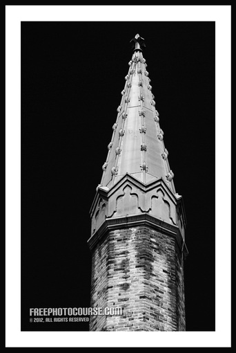
But, don't give up on that single spire picture yet! If you have a color photo that follows all of the rules, but somehow just doesn't hit the mark, why not see what it looks like in black and white? There are many different ways to covert a color photo to monochrome, but in addition to merely desaturating the image, you might also want to explore using different digital RGB filters or channels in your post-processing. Interestingly, when we use a red filter (ie. selecting only the red channel in Photohop), the single spire picture becomes far more dramatic and interesting than it appears in its color version. Matted and framed professionally, this black and white version could make for a very dramatic piece of wall art. See what I mean below:
So, the bottom line of this article/tutorial?
Although there are some exceptions to the rule, always remember to apply OTO and LIM...
that is, One Thing Only and Less Is More!
PREVIOUS COMPOSITION TUTORIAL NEXT COMPOSITION TUTORIAL
Check back for more Photo Composition Tips and Tutorials,
because we'll be adding more on a regular basis!
LINKS:
HOME PHOTO TIPS INDEX FULL COURSE INDEX "HOW TO" INDEX PHOTO FORUM GREAT CITIES EXPOSED
SITE SEARCH CONTRIBUTOR'S GALLERY COMPOSITION TUTORIALS PHOTO LINKS FREE DIGITAL IMAGES
© FreePhotoCourse.com. All rights reserved. Reproduction, storage, copying, publishing, manipulation, digitizing or selling of any of the text or photos on this website is strictly prohibited. Under no circumstances shall any part of the content on this website be plagiarized or referenced as the work of an author or photographer. Re-selling of any of the content on this site is strictly prohibited. The lessons on this website were provided free of charge for individual home users; if you paid for any of this you have been cheated. Please report any misuse, sale or plagiarism of this material here OR E-MAIL US AT: CONTACT@FREEPHOTOCOURSE.COM
Browse, learn, purchase and explore with confidence.
Certified virus-free, malware-free, spyware-free, scam-free and spam-free.
Certified virus-free, malware-free, spyware-free, scam-free and spam-free.


