Professional Photography
|
|
Photo Composition Tip #2
Negative Space - Giving the Eye a Rest Article and Photography by Stephen Kristof Staff Writer/Photographer © 2012, FreePhotoCourse.com; all rights reserved In her last tutorial on photographic composition, Emma David explained how important it is to avoid clutter in your frame, and how doing so requires an observant eye to give a lot of attention to detail. Closely related to the concept of clutter - or the lack of it - is the composition theme of 'negative space'. If you've ever taken a graphic design course you likely grew weary of the term 'white space' and related advice about how important it is to avoid overloading your layout with too many elements or with too much varied content. The same theme is very much a part of successful photography; at least it is if you want people to find your work artistic and attractive. It's interesting how our brains tend to feed on variety, seeking an ever-changing landscape of visual options and stimuli. However, as photographers, we need to be careful to avoid photographing scenes that are chock-full of all sorts of things that excite and tempt the visual side of our consciousness. As interesting as it may seem in person, photographs that offer the eye little repose can have the opposite effect. The eye is confused by everything that's going on and, without a break in the visual action, simply gives-up and moves on to the next image. "...create some negative space; that is, an area where the eye can take a breather - an intermission of sorts." So, the idea is to identify which aspect of your subject (or which part of your surroundings) is the most important and interesting element in the picture you're trying to create. It's a simple enough task and merely requires the photographer to basically rate what he or she sees, in the order of importance within the context of the intended photo's overall feel or message. For example, let's say it's Autumn and you're about to take a picture of a forested area, the trees now bare and their red-brown leaves carpeting the ground. What's the most important part of the image you see in your mind? Is it the stark and twisted tree limbs, the blue sky dotted with white clouds, a park bench in the foreground, a couple walking hand-in-hand in the distance or is it something else? While any of these elements could make for an aesthetically pleasing picture, the star of the show likely has something to do with the carpet of leaves covering the forest floor. Why not give the leaves center-stage and leave-out some of the other elements. Perhaps the leaves will create some negative space; that is, an area where the eye can take a breather - an intermission of sorts. |
|
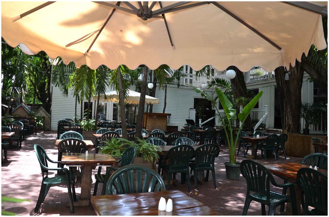
Consider the scene in the pictures shown below. It's the kind of open-air dining patio you might see around any corner in old Key West, Florida. It looks so inviting, you can almost imagine pulling-up a chair and kicking your feet back as the balmy breeze tussles your hair. The picture on the left has a lot of interesting elements, many of which provide context. But, while the umbrella, the tropical flora and old achitecture in the background are inviting, there just seems to be too much of everything in the picture and not enough "nothing". The result is that the eye becomes stagnant, not really knowing where to look, while the plastic chairs gain an unintended prominence.
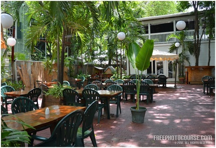
By contrast, the picture above on the right has far better composition, providing some breathing room in the bottom left corner. That negative space (the brick patio) is gently dotted by sun and shadow, but doesn't scream for attention and provides a much needed respite. And while it's the same Key West patio featured on the left, it somehow seems more spacious, more relaxed, more inviting. There's also less emphasis on the chairs and more of a sense of wanting to have a seat in one! All it took was taking the camera to the right by about twenty feet or so.
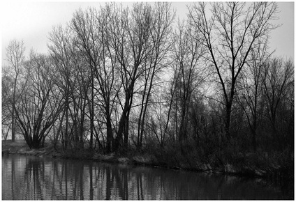
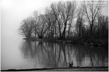
Don't forget that when you're looking through your camera's viewfinder, you also have the benefit of the rest of the scene around you that you may have omitted from the frame. That can trick a photographer into having the sense that there's more negative space in the frame than he or she has actually provided. The image below on the left is somewhat interesting; particularly in the way that the silhouetted trees contrast sharply against the white sky, or the way in which the trees reflect gently in the water. However, the picture below on the right is a far better and more artistic treatment of the same scene. The negative space that hugs the trees and their reflection provides an area where nothing is happening, thus encouraging the viewer to stick around a little longer.
Don't forget that when you're looking through your camera's viewfinder, you also have the benefit of the rest of the scene around you that you may have omitted from the frame. That can trick a photographer into having the sense that there's more negative space in the frame than he or she has actually provided. The image below on the left is somewhat interesting; particularly in the way that the silhouetted trees contrast sharply against the white sky, or the way in which the trees reflect gently in the water. However, the picture below on the right is a far better and more artistic treatment of the same scene. The negative space that hugs the trees and their reflection provides an area where nothing is happening, thus encouraging the viewer to stick around a little longer.
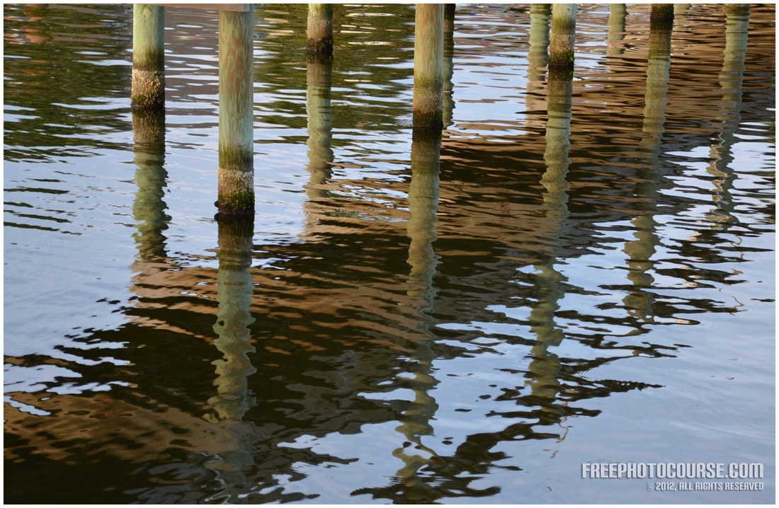
Look at the pictures below and see how the composition is improved dramatically, simply by moving the camera slightly toward the right and zooming out to a bit of a wider angle. The image on the left appears to have too many elements and the reflection of the fishing pier appears to cut the frame in half, diagonally. The image to the right has the same attractive rhythm and content, but it is not all bunched-up.
Yet another example below, shows how this scene at the edge of a small bay benefits from negative space on the left. The space tends to further define the curve of the land and contrasts it against the ocean, while improving balance.
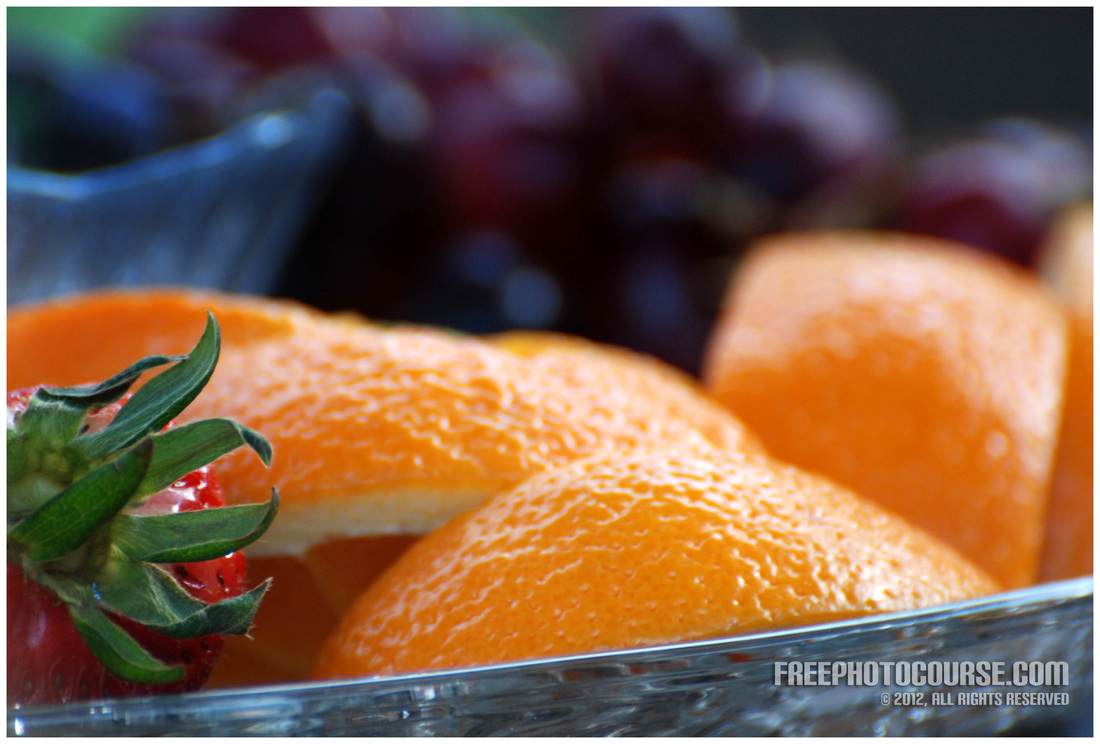
In the final example, see how I have created much needed negative space in this still life image. By shooting with a large aperture, the resulting short depth of field creates a kind of drop-off where nothing's vying for your attention. The blurry bokeh in the background is visually calming and attractive, but the lack of focus allows for much needed negative space.
So, the bottom line of this article/tutorial?
Always leave some space in your frame where nothing is happening and it will make the rest of your photo more interesting!
NEXT PHOTOGRAPHY COMPOSITION TUTORIAL:
SIMPLICITY
(CLICK ABOVE TO READ THE ARTICLE)
Check back for more Photo Composition Tips and Tutorials,
because we'll be adding more on a regular basis!
LINKS:
HOME PHOTO TIPS INDEX FULL COURSE INDEX "HOW TO" INDEX PHOTO FORUM GREAT CITIES EXPOSED
SITE SEARCH CONTRIBUTOR'S GALLERY COMPOSITION TUTORIALS PHOTO LINKS FREE DIGITAL IMAGES
© FreePhotoCourse.com. All rights reserved. Reproduction, storage, copying, publishing, manipulation, digitizing or selling of any of the text or photos on this website is strictly prohibited. Under no circumstances shall any part of the content on this website be plagiarized or referenced as the work of an author or photographer. Re-selling of any of the content on this site is strictly prohibited. The lessons on this website were provided free of charge for individual home users; if you paid for any of this you have been cheated. Please report any misuse, sale or plagiarism of this material here OR E-MAIL US AT: CONTACT@FREEPHOTOCOURSE.COM
Browse, learn, purchase and explore with confidence.
Certified virus-free, malware-free, spyware-free, scam-free and spam-free.
Certified virus-free, malware-free, spyware-free, scam-free and spam-free.


