LINKS TO OUR OTHER CONTRIBUTORS' PHOTO GALLERIES:
2016 Contributors' Gallery (CURRENT)
2015 Contributors' Gallery ARCHIVES
2014 Contributors' Gallery ARCHIVES
2013 Contributors' Gallery ARCHIVES
2012 Contributors' Gallery ARCHIVES
2010 Contributors' Gallery ARCHIVES
2016 Contributors' Gallery (CURRENT)
2015 Contributors' Gallery ARCHIVES
2014 Contributors' Gallery ARCHIVES
2013 Contributors' Gallery ARCHIVES
2012 Contributors' Gallery ARCHIVES
2010 Contributors' Gallery ARCHIVES
SCROLL DOWN to enjoy the 2011 MONTHLY PHOTO GALLERY
Want to Show-Off Your Photo to the World?
Currently accpeting photo submissions for our regular monthly 2016 photo gallery.
(Limit: 2 photo submissions per month)
|
2010 Contributor's Gallery Archives
(Click on Image Below) |
2011 Contributor's Photo Gallery
DECMEMBER 2011 - Submissions by Raju Singh, India
Raju tells us that he is an engineering student who also has plans to make photography part of his future. With fine work like the pictures shown above, he is sure to make that dream come true! We were thrilled to get these images from Raju, as they were the most colorful, vibrant and celebratory images of all we received during the month of December. What an expressive and suitable way to end the year and to close-out our 2011 Contributor's Gallery!
Raju shows us, as did Carmel Lalo in the October 2011 selections, that some impressive photographic work can be composed using a bridge point-and-shoot camera. Just like Carmel, Raju's camera is one that has a lens with a far wider diameter than is found on the average point-and-shoot camera. Look at the difference it makes in the overall clarity and excellent latitude of exposure. Raju explained to us that these pictures embody the idea of festival and culture that is so equally vibrant in his home of India.
We like how the pictures are composed, the perfect exposure and Raju's choice of subject matter. There is plenty to add to clutter in each of the pictures, but they really don't seem cluttered at all. The picture on the left uses a longer depth of field to keep things sharp into the background, while the picture on the right has a shorter depth of field. Even though the apertures for each image are similar, take a look at the focal length. The one on the left is not as zoomed-in as the picture on the right. Zooming deeper provides shorter depth of field, which is why the picture on the right blurs more quickly into the foreground and background. Both pictures accomplish what they should and provide a celebratory feeling, no matter what your culture or background may be!
Thank you Raju for submitting these spectacular pictures and Happy New Year to you!
NOVEMBER 2011 - Submissions by Mike DiRenzo, Coram, New York
|
|
Mike DiRenzo previously submitted some dramatic photos to our first "Great Cities EXPOSED" exhibit, "NYC Exposed". He's at it again and has been chosen by our submissions team to represent the best of submissions in our general Contributor's Gallery for the month of November, 2011. It's no surprise to us that his most recent submissions, three of which appear to the left, capture the excitement and overall pace of life that is so...New York! The unisphere picture at the top left is an awe-inspiring example of slow-shutter combined with optimal backlighting from a setting sun, the sky ablaze with fantastic hues! Note how the fountain sprays soften with the passage of time during this slow 1/6 second exposure. What a postcard-perfect photograph! Any longer than the 1/6 of a second would have made the fountains look too hazy and ill-defined, as even a slight breeze would mush one fountain into the next. Mike opts for a high f/stop of 18 which, of course, closes the aperture. Remember that a high f/stop increases depth of field, ensuring more clarity for both close and far objects. His ISO in this case is a whopping 2000, which is necessary given the relatively dark setting and the far shorter exposure compared to the other two pictures. So, why doesn't this picture that uses a very high ISO setting have a lot more noise compared to the outer two that use far lower ISO settings? Fortunately, more advanced cameras have invaluable features such as "high ISO noise reduction" and "long exposure noise reduction" that can do a wonderful job when it comes to correcting these problems. The storied "Naked Cowboy" in the picture shown just above on the left is more about timing than anything else. While the subject is a tourist attraction in himself, he has also become such a standard and expected part of Times Square that he has become a fixture of the visual environment. What makes this picture so interesting is that he appears to be caught off-guard and somehow out of the element. While the cars and most of the people are in a frenzied motion blur, the cowboy appears frozen in some pensive moment-in-time. Quite an interesting picture by Mike! Finally, the final picture we chose to post here is fabulously simple and the message is very clear. Despite the cacaphony of lights, people, taxis, signs and other visual 'noise', it all somehow seems to come together in one basic idea: this is truly the city that never sleeps! Thank you, again, Mike for submitting these photos. It's a different way of looking at November and reminds us how good photographers can tell a story without uttering a single word! |
OCTOBER 2011 - In October we selected two submissions for publication:
|
Submission by Carmel Lalo
Israel
|
Submission by Martin Trevena
Brisbane, Australia
|
SEPTEMBER 2011 - Submission by Herb Colling, Belle River, Ontario, Canada
(Featuring "Military Muster" demonstration)
|
Far removed from the usual subject matter submitted by our visitors, we were intrigued with this particular image for a couple of reasons. First of all, the photo depicts a rather gritty, unnervingly realistic military situation. Even more important than this is the feeling of action that the picture evokes.
Photographed during a demonstration at the Canadian Transportation Museum and Heritage Village, Herb Colling was absolutely on-the-ball in terms of discerning what is important in a shot. The hand-shielded ear, the soldier kneeling on one leg and the smoke hugging the ground; they all marry to give a strong sense of movement and life. You can almost feel and hear the reverberations of the heavy artillery. It all makes sense, though, when you know a bit more about the photographer. Herb forged a career as a journalist with the Canadian Broadcasting Corporation, and |
is a published author of historical books and travel articles. A lifetime of writing and telling stories in the theatre of broadcast and literature has impacted the way that Herb uses the camera; in much the same way, it's merely another tool with which he tells stories. Thank you, Herb, for your submission and for showing us that the still camera can capture and preserve action that occurs in a split second...and the result can ignite the imagination!
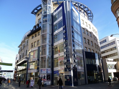
AUGUST 2011 - Submission by Alexander Duricky, Ostrava, Czech Republic
|
When our Submissions Review Team initially considered this image from Alexander Duricky, they thought that it was not much more than yet another picture of a building. However, at second and third glance, they became galvanized toward the idea that this is truly an interesting piece of photographic artwork.
What makes it most remarkable is the perspective. While the building is a mesh of new and old - as is much of the area of Ostrava, the Czech Republic's third largest city - it is the angle of lighting and the lens perspective tha helps to fuse it together. Alexander's sharply contrasted and properly-exposed picture provides eye candy and impact that reinforces the idea that well-planned and interesting architecture can help glue and preserve an old city's history within the context of an exciting new look. Thank you for your submission Alexander! |
JULY 2011 - In July we selected 3 submissions from the same photographer:
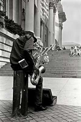
Joseph Constantino, Long Island, N.Y.
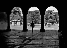
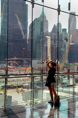
Joseph Constantino is no stranger as a FreePhotoCourse.com contributing visitor. Some of his deeply expressive work was previously chosen to be part of our NYC Exposed photo exhibit. We decided to publish all three of Joseph's submissions to represent the best of all of the many photos that our Submissions Review Team looked at during the month of July. This is fine work and shows some very different, yet, artistic approaches to the craft of photography.
The first photo to the left is a trip back in time, its composition, exposure and subject matter married in such a way as to suggest a traditional style and a more innocent time. All of the elements are beautifully arranged and help the eye to move around the picture in the desired manner. Bravo Joe for this exceptional work!
The image in the middle takes advantage of a natural frame and silhouetting, lines on the ground and rounded curves that make the eye feel content to keep staring. Again, Joseph's composition and exposure are perfect. The person walking toward the middle arch emphasizes the motion and harmony.
The final image on the right would be a scattered mash-up of clutter...were it not for the woman peering into the mix. Her position in the frame is wonderfully placed. The subtle colors add interest but their pastel nature help tame the clutter aspect. She is looking at the construction taking place at Ground Zero, where the new Freedom Center is built.
These are all interesting and visually attractive pictures that would be welcome additions to any wall, anywhere.
JUNE 2011 - In June we selected 2 submissions:
|
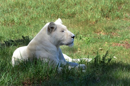
Submission by Shaun Thesnaar, Port Elizabeth, South Africa
(Featuring a white lion in the wild, Seaview Lion Park)
|
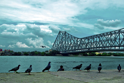
Submission by Sudipta Chakraborty,
West Bengal area, India (Featuring the Howrah Bridge, Mullick Ghat)
|
MAY 2011 - Submission by Gale Punay, Basildon, Essex, U.K.
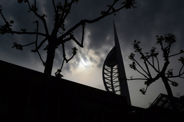
(Featuring Spinnaker Tower in Portsmouth, U.K.)
|
Gale Punay hit a home run with this particular picture. She tells us that she recently purchased her new Nikon D3100 and has enjoyed learning to use it. At present, she is working toward mastering manual exposure (Two Thumbs Up for Gale!) and she says that FreePhotoCourse.com has been very helpful in her journey of photographic learning. Thanks for the compliment!
Gale took this picture as the trees were beginning to bud. She exposed this just right; enough light to define the silhouette, but not too much as to illuminate the objects. The tower is properly positioned, as are the other elements (trees, building). The clouds and their definition also adds interest to this image. It is haunting and artistic. The persepctive completes it. Congratulations Gale and enjoy the personalized certificate we have sent you! |
APRIL 2011 - Submission by Joan McCormack, Dallas, Texas
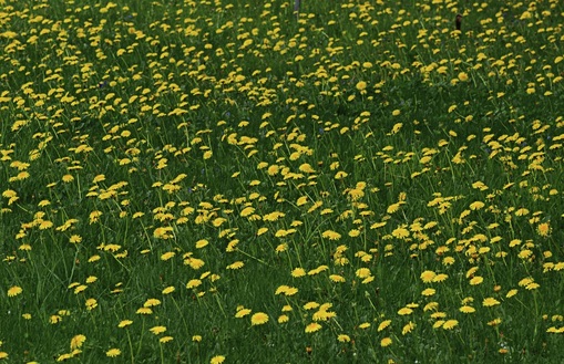
(While traveling in Braunwald, Switzerland)
|
Ahh, April...warmer temperatures, the greening of lawns and...ughh! The dreaded dandelion! This picture has a different take - one that's attractive.
Joan McCormack of Dallas took this shot on a recent trip to Switzerland, but we were particularly interested in the fact that she ignored the mountainous terrain around here and opted, instead, for the show that was going on right at her feet. The fairly shallow depth of field here allows the yellow flowers to blur into the background, suggesting a wider field than there may have been. It's simple and common, yet somehow peaceful and reassuring. It reminds us of our March selection below - don't try too hard looking for fancy stuff because the regular stuff may be interesting too! |
MARCH 2011 - Submission by Renée Desjardins, Saint-Étienne, France
|
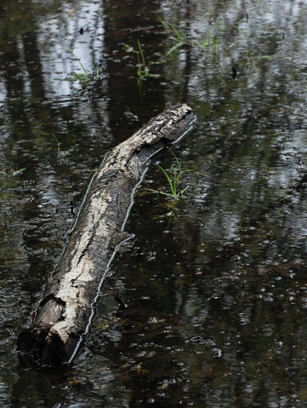
What a beautiful and serene photograph this is! Renée understands, as do we here at FreePhotoCourse.com, that subject matter need not be spectacular in order to create a photographic art piece that is compelling and that evokes a certain mood or feeling.
The spring thaw brings many surprises in various parts of the world where snow has fallen through the winter. In Renée's particular part of the world, Saint-Étienne, France, winters can be quite harsh. The simplicity of this picture is gorgeous. The log, soaked by snow that has now become a large puddle, has compositional beauty; its slight curve to the left at the top of the log gives the picture movement and direction. The gentle tree and sky reflection in the puddle, blurred by both short depth of field and the motion of wind, give the picture context. The few blades of grass popping-up here and there provide just enough of an alternative color in order to keep things visually interesting. As noted above, this is truly beautiful work that Renée should be very proud of! For all of our readers and visitors, we would encourage you to take note of this fact; your photo subjects don't have to be amazing, but what you do with ordinary things can be! |
FEBRUARY 2011 - Submission by Bob M., Sheffield, Great Britain
(Featuring scene in Windsor, Ontario, Canada)
|
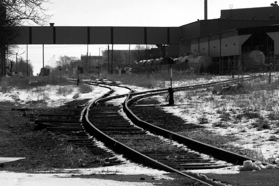
As our Submissions Review Team sifted through the many pictures received through February, something struck them about this particular image. The way that the snow, had partially melted around the train tracks, the beautifully composed curves offered by the winding and splitting tracks and the industrial elements all combine to create something more interesting than the mere content.
Great choice of monochrome (black & white), Bob! It compliments the overall feeling of stillness. This is a scene that could look quite ordinary and few would bother to photograph it, but Bob saw something artistic here and we fully agree! Coincidentally, when our Review Team went through the details, they were surprised to see that, while Bob lives in Sheffield, Great Britain, he actually photographed this while visiting family in Windsor, Ontario, Canada...yes, the same location as our January contributor listed below! |
JANUARY 2011 - Submission by James Orr, Windsor, Ontario, Canada
(Featuring early morning scene in Venice, Italy)
|
|
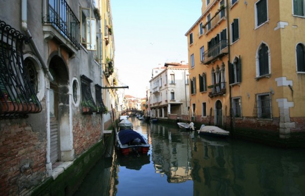
While on vacation in Venice, James had his camera at the ready to capture the classical beauty revealed at every turn of the head (and of the gondola...). The result is a very attractive and artistic composition that is as mesmerizing as it is interesting.
The nearly still water is not quite still enough to create a perfect reflection; this is of particular importance in this beautiful image! The gentlly wavy distortion of the reflected old-world buildings that line this waterway encourage the viewer to take pause and linger over this photograph. In a way, the history, pastel colors, lack of human activity and beautiful reflection come together in perfect harmony. A sense of serenity fills the senses... Congratulations James; what a great way to start off what promises to be a fantastic 2011 filled with many more captivating reader-submitted photos! |
Have a photo you want to show-off to the world?
Use our Electronic Submission Form
Send us your "best of the best" and if it's good enough, we'll post it for the world to see!
If our Submissions Team decides to post your image here it means something special is going on with your photography. You have the pride of knowing that your photography is at a higher level. Best of all, you can show your posted work to friends and family - you can also put-up a link to this page up on your Facebook, Flickr or other sharing site!
NEW!! - Contributors with a photographic work that is accepted and posted here will receive a special certificate by e-mail.
In a way, it's a bit like winning a photo contest where your work can be seen by the world!
Currently accepting photo submissions for our regular monthly 2016 photo gallery.
(Submission Limit: Maximum 2 pictures per month)
LINKS:
HOME PHOTO TIPS INDEX FULL COURSE INDEX "HOW TO" INDEX PHOTO FORUM
SITE SEARCH CONTRIBUTOR'S GALLERY CAMERA & GEAR STORE FREE DIGITAL IMAGES
GREAT CITIES EXPOSED SERIES TOP PHOTOGRAPHER PROFILES PHOTOGRAPHY RESOURCES
© FreePhotoCourse.com. All rights reserved. Reproduction, storage, copying, publishing, manipulation, digitizing or selling of any of the text or photos on this website is strictly prohibited. Under no circumstances shall any part of the content on this website be plagiarized or referenced as the work of an author or photographer. Re-selling of any of the content on this site is strictly prohibited.
Browse, learn, purchase and explore with confidence.
Certified virus-free, malware-free, spyware-free, scam-free and spam-free.
Associate-Sponsor Disclosure Content Download & Terms of Use Privacy Policy Contact Us Contributor's Gallery Terms of Use Forum Terms of Use
Certified virus-free, malware-free, spyware-free, scam-free and spam-free.
Associate-Sponsor Disclosure Content Download & Terms of Use Privacy Policy Contact Us Contributor's Gallery Terms of Use Forum Terms of Use


