|
|
NYC EXPOSED
Part of the "Great Cities Exposed" Online Photo Exhibit Series |
"NYC EXPOSED" Online Photography Exhibit - GALLERY 05
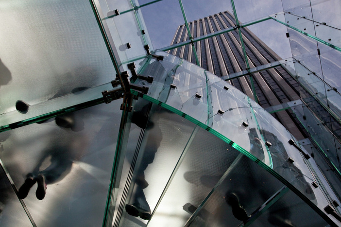
While most people gaze laterally across from the sidewalk toward the Apple store on 5th Avenue, award-winning professional photographer Mike DiRenzo realized that the real magic was happening above! The beautiful clean lines and sexy curved glass are only eclipsed by the ethereal beings that appear to disappear into a fog.
Talk about striking composition! Mike understands a lot about balance and how to use elements to move the eye around the frame. Take a look at the picture once again and see where your eye starts, where it moves toward, how it lingers and then darts off once again. Moving the open sky toward the top left corner was a wise photographic decision, but putting the skyscraper in that same spot was even more insightful.
Imagine how the photo would look were it not for the building looming in the background. The picture would still look interesting and unusual, but would lack a certain context and perspective. The angle and straight vertical lines of that building allow the viewer to get a sense of where one is in relation to the surrounding and that makes the scene that much more interesting. This NYC Exposed exhibit is not merely about 'landmarks' or icons of New York City, although there are many examples of that throughout the galleries. Rather, it's more about a collection of fine photographic art that represents NYC in a beautiful, interesting, expressive and emotionally poignant manner.
Mike DiRenzo's fine work above meets all of these objectives...and then some!
You can see more of Mike's amazing photography at: http://mikedirenzophotography.com/
|
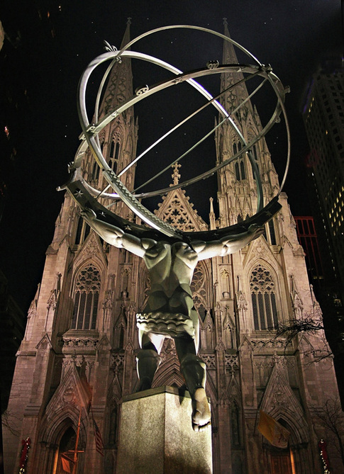
When Mike DiRenzo isn't photographing awesome glassy images like the Apple store picture featured above, you might just find him serving in his position as President of the Huntington Camera Club, New York. Looking at the quality of his work, it's no wonder he is in this position. Mike photographed the beauty to the right back in 2006. It really doesn't matter how old the photo is; it's a classic. We were looking for unusual perspectives of both ordinary and iconic aspects of NYC life for this exhibit. This scene is certainly iconic, but it also benefits from the stretched perspective, symmetrical composition and subtle colors of the night lighting. The picture is crystal clear. In fact something happened here that's a bit curious. Mike's use of an 18mm focal length means that he had to be rather close to the base of the statue in order to get this shot. That being said, St. Patrick's cathedral is across the street from the bronze Atlas...far enough in the background that Mike's wide open aperture (f/3.5) should have resulted in significantly short depth of field, rendering the church with a great deal of blur. Hmmm. That's not what happened! As you can see, the church appears almost as clear and crisp as the lines in the statue. It's got us stumped here at FreePhotoCourse.com! In any event, what a stunning NYC photograph! Next time you're in the neighborhood of 630 Fifth Avenue at night, spend some time to take-in this impressive juxtaposition of the Greek mythological figure in front of the Gothic revival-style architecture. It's really a sight for sore eyes! Thank you Mike for this gem! |
Atlas and St. Pat's (Atlas Statue with St. Patrick's Cathedral in background) Photography by MIKE DIRENZO Coram, NY |
|
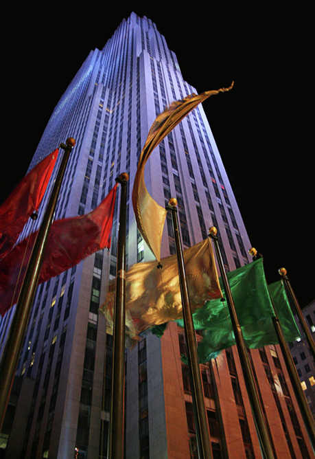
The Rock in Color (Rockefeller Center at Night) Photography by MIKE DIRENZO Coram, NY |
If you look at Mike's camera exposure data on the Atlas image above, you'll notice that it's exactly the same as what he used to photograph the image to the left. Well, he just had to make two quick right turns in order to come face-to-face with yet another imposing structure...Rockefeller Center. Mike didn't walk very far from the bronze Atlas statue and in that short time, must have realized that the same camera settings would work equally well for this spectacular night-lit shot of "The Rock" during the Christmas season. With the season comes a change of stripes - literally - changing the "stars and stripes" flags to the red, gold and green. The combination of gently saturated primary colors in front of the pastel purple of the building is nothing short of eye candy! The satin flags appear fluid, as they ruffle in the cold evening breeze; the long 1/20 of a second shutter speed helps to capture the motion of these flags with a bit of blur and some smoothing. It results in a feeling of motion. (Don't you just love the way that the center gold flag seems to whip around on its own; as if it's dancing to the beat of a different drummer!) This picture is as much about color as it is about composition. It's also just as much about photography as it is about New York City! Notice how the purple facade blends - almost unnoticeably - to a warmer golden tone somehere just behind the flags. Notice, as well, how the building is put just slightly off-center for a pleasing composition. As if following classic rule-of-thirds convention, the middle gold flag points toward the right side of the frame, making way for the slightly wider space on the right side of the building tower. The picture shouts "New York City" loud and clear. Yes, the building is iconic, but the style of photography is also bold, full of flare and strength. It has motion, romance and life - just like the city itself. |
"I Want That!"
('Famously New York' Moment in Time)
Photography by JOSEPH CONSTANTINO
Long Island, NY
A truly classic New York Moment...
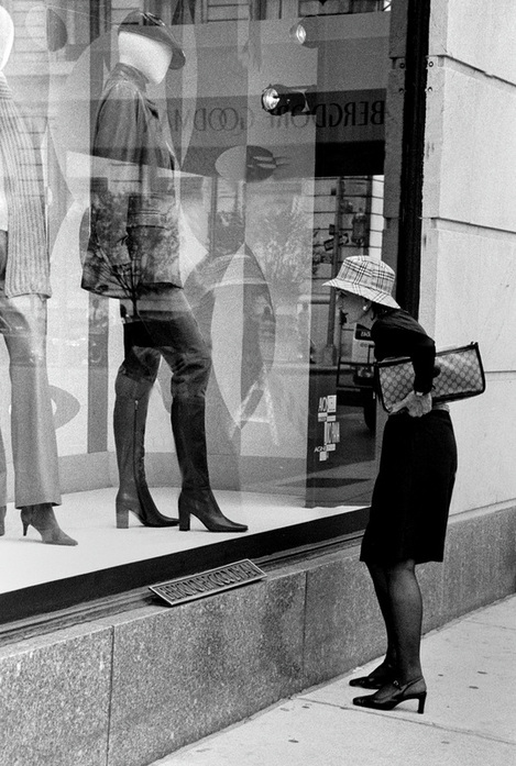
Long-time photographer Joseph Constantino got a lucky shot here! The well-dressed woman appears to be stopped in her tracks as she gazes at a window dressing display at the Bergdorf-Goodman store on 5th Avenue. Just around the corner and across the fountain from the Plaza Hotel, the woman certainly possesses the poise and class associated with this particular scene.
Joe's keen photographic eye quickly summed-up the potential here. What's also remarkable here is the reflection in the window, "mirroring" the store's name from across the street. (For those who haven't seen this, Bergdorf-Goodman occupies both sides of the street. She's looking into the window of the older building (formerly the Cornelius Vanderbilt mansion) and the other Bergdorf sign from the other side of the street gives some unexpected perspective.
The woman's position in relation to the frame is excellent and well composed. There is a harmony of elements, while not being symmetrical, that makes for a very enticing visual. When you think about it, it's as though the mannequin is staring back at the woman. Who is studying whom? Hmmm!
Met Arches
(Art Inside of Art)
Metropolitan Museum of Art
Photography by JOSEPH CONSTANTINO
Long Island, New York
Photography by JOSEPH CONSTANTINO
Long Island, New York
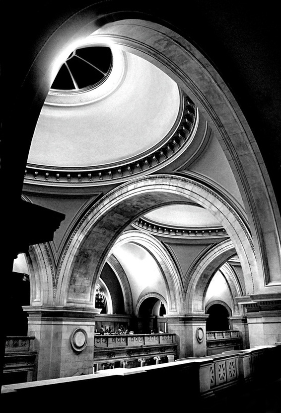
Joe Constantino used a solarization technique on this gorgeous and stunning picture of the arched ceiling inside the Metropolitan Museum of Art. The result is exceptional; the effect highlights areas of shadow and light for a desirable contrast that brings out the texture of the stone and engraving. However, the technique preserves the mid-tones so that you have the best of both worlds. The photo gives the appearance of grandeur, grace and harmony. It capitalizes on the direction of light and the resulting shadows to reveal beautiful form.
One word sums-up this magnificent photo - Wow! It's ironic that one begins to reflect on the idea that the Met's architecture is, in fact, artwork in itself. Founded in 1870 by a group of New York City philanthropists, the Met's purpose was and has always been to encourage and develop the study of the fine arts; not merely to amass an amazing collection of art (which is does have). The building's grand and stately facade on Fifth Avenue was featured in some major motion pictures. The Thomas Crown affair, for one, used the front of the Met as a museum from which Pierce Brosnan's character steals a famous Monet painting. The more recent movie, Wall Street - Money Never Sleeps, uses the Met's front steps in an important scene. In that scene, Michael Douglas' character, 'Gordon Gekko' is engaged in an emotionally-charged conversation with his daughter who has little respect for him.
Joe's decision to use a short focal length helps to widen and distort the arches for enhanced effect. The arches become drawn-out, which makes for an absolutely irresistible image - you just don't want to look away. Beautiful work, indeed!
To see more of Joe's photographic work, and get a taste of his new book, visit: http://joecphotography.com/
"Stately Old Library"
(Stephen A. Schwarzman building, New York Public Library)
Photography by JOSEPH CONSTANTINO
Long Island, NY
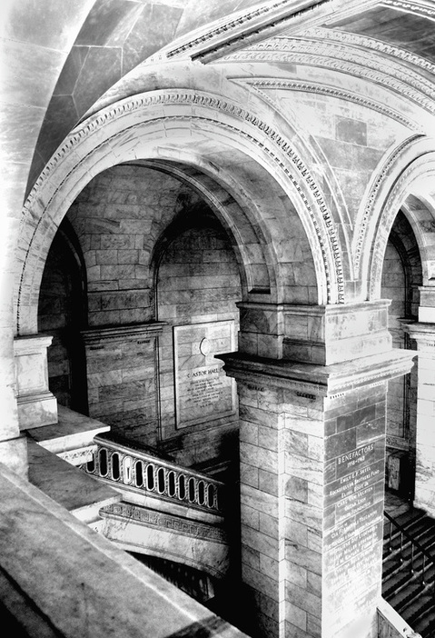
Yet Another look at the New York Public Libary on 42 Street - we simply couldn't resist. While we featured Mathew Spolin's fine photo art of the same building in Gallery 02 of this NYC Exposed exhibit, we decided to give it another go. Mat had a similar idea, yet used two different light sources to provide for a very thoughtful visual expression. In this version, Joe uses a single direction of light combined with the solarization technique. The result, much like Joe's previous MoMa picture, is the revelation of the more subtle textural quality of the stones and engragins. 3-D form, again, is celebrated.
If you haven't ever set foot in this magnificent library, what's stopping you? It is as central to New York City as is Lady Liberty; just not quite as splashy, but every bit as beautiful and elegant.
If you haven't ever set foot in this magnificent library, what's stopping you? It is as central to New York City as is Lady Liberty; just not quite as splashy, but every bit as beautiful and elegant.
"Respite From the Rain"
(Ducking the Rain in Central Park)
Photography by JOSEPH CONSTANTINO
Long Island, NY
Rain can be beautiful and magical...
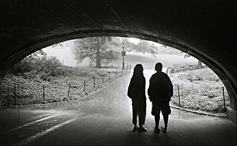
Joe found some more magic in this dream-like image of two young people taking shelter from the rain in one of Central Park's bridge/tunnels. You've got to love the soft focus, semi-silhouette and outward gaze. The gentle reflection on the left side of the street accentuates the rain's power and freedom. The young couple is set just to the right of center, allowing the viewer to gaze beyond them, down the street and toward the lamp post and rolling landscape.
This is unassuming artwork. This is thoughtful and beautiful. This is stunning photography in a very familiar place to most who call themselves "New Yorkers".
THIS EXHIBIT IS NOW CLOSED TO SUBMISSIONS.
WE WILL BE LAUNCHING NEW PHOTO GALLERIES AND PHOTOGRAPHY EXHIBITS IN THE COMING MONTHS.
IF YOU ARE INTERESTED IN BEING PART OF ONE OF OUR NEW EXHIBITS,
VISIT FREEPHOTOCOURSE.COM REGULARLY
FOR UPDATED INFORMATION ON UPCOMING CHALLENGES AND PHOTO EXHIBITS.
Please read our Content Download and Use Agreement if you have any questions regarding content rights for images appearing in this gallery. Please respect the rights of the photographers whose work is featured in this online exhibit. Photos in this exhibit are the property of the named photographers. Copying, storing, transmitting or otherwise using any of these images without the express permission of the named photographer is prohibited.
LINKS:
HOME PHOTO TIPS INDEX FULL COURSE INDEX "HOW TO" INDEX PHOTO FORUM
SITE SEARCH CONTRIBUTOR'S GALLERY PHOTOGRAPHER PROFILES FREE DIGITAL IMAGES
© 2011, FreePhotoCourse.com. All rights reserved. Reproduction, storage, copying, publishing, manipulation, digitizing or selling of any of the text or photos on this website is strictly prohibited. Under no circumstances shall any part of the content on this website be plagiarized or referenced as the work of an author or photographer. Re-selling of any of the content on this site is strictly prohibited.
Browse, learn, purchase and explore with confidence.
Certified virus-free, malware-free, spyware-free, scam-free and spam-free.
Associate-Sponsor Disclosure Content Download & Terms of Use Privacy Policy Contact Us Contributor's Gallery Terms of Use Forum Terms of Use
Certified virus-free, malware-free, spyware-free, scam-free and spam-free.
Associate-Sponsor Disclosure Content Download & Terms of Use Privacy Policy Contact Us Contributor's Gallery Terms of Use Forum Terms of Use
