Want to Show-Off Your Photo to the World?
Currently accepting photo submissions
(Limit: 2 photo submissions per month)
December 2014
Photography by
Bill McElroy
Detroit, Michigan
Photography by
Bill McElroy
Detroit, Michigan
|
|
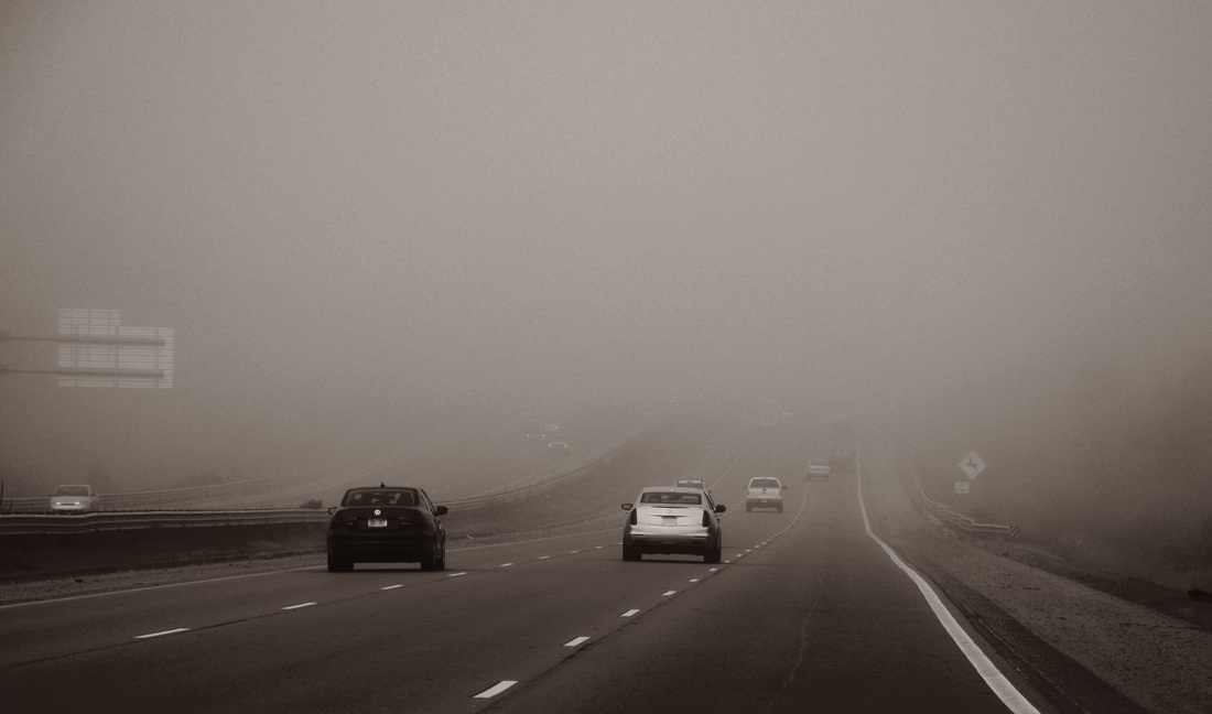
At first glance, this picture by Bill McElroy looks like an ordinary snapshot of a not-so-busy highway in anytown, USA. But, upon further examination, one begins to discern a message that's less ordinary and more meaningful. Bill McElroy, who lives near the Motor City, tells us that he shot this interesting highway pic while on his way to Michigan's Upper Peninsula (the "U.P." - as Michiganders call it.) Driving north on I-75 in early December and just past the hustle and bustle of Detroit, the snow had not yet made a permanent visit, so the ground was bare.
However, the weather was changing and Bill's early morning trek turned into a white-knuckled, fog-filled drive. We love how the road slopes upward as the fog gets thicker. It's a different side of winter; a scene that appears to be longing for colder weather and snow; one that is transitional and lonely. It's certainly an interesting image and one that our Submissions Review Team chose over dozens of more colorful and traditionally "Christmassy" images, because this one was truly unique with a different meaning of winter. |
November 2014
Photography by
Lynn Brookes
Birmingham, England
|
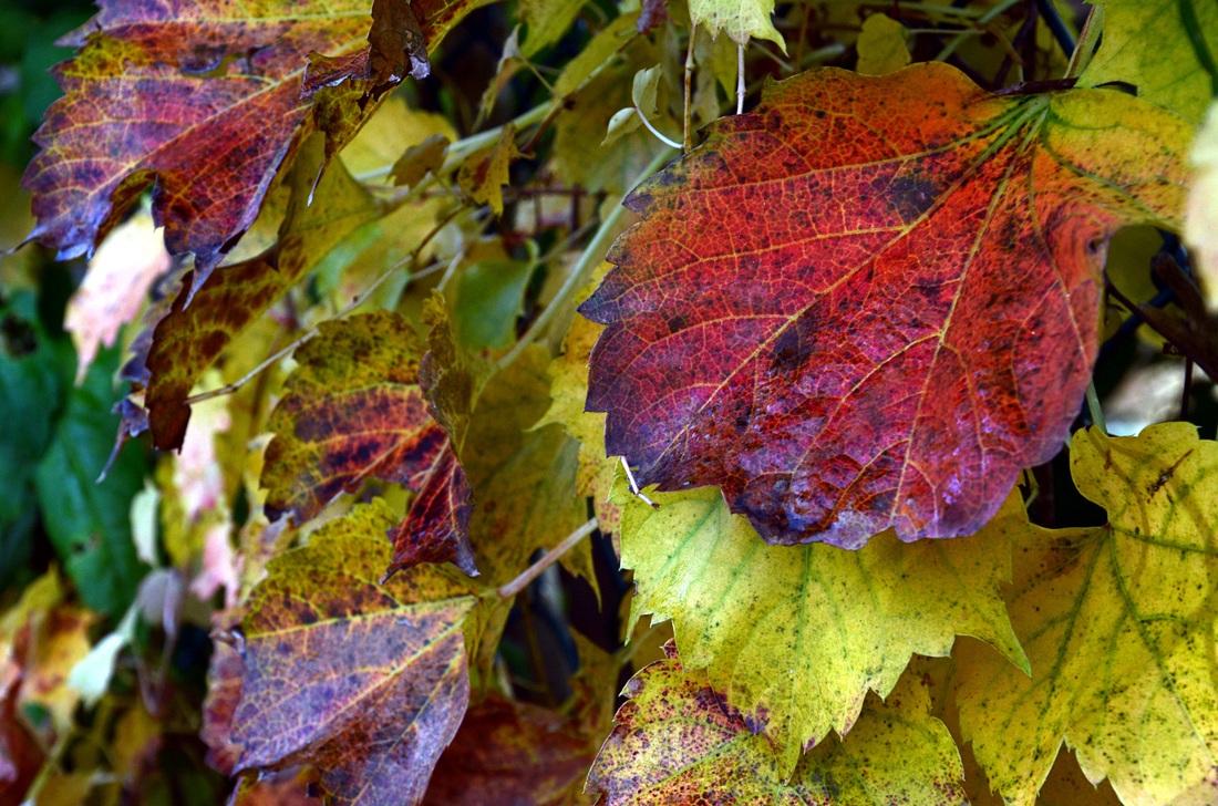
Simplicity is an important photographic composition theme and UK based photography enthusiast, Lynne Brookes, captured a scene that is simple in both its familiarity and its subject. What a delightful take on a quintessentially autumnal idea; ivy leaves captured on their colorful fall journey. Lynn's photo has short depth of field that blurs-out the green leaves in the background on the left. However, it was not her f/stop that provided this shallow focus. Rather, her close proximity to the leaves using a true Pentax macro lens produced the effect. Smart photography! Using an f/8 ensures clarity throughout the different distances of the red leaf (which is the focal point), with the close lens-to-subject proximity producing a more gentle drop-off of focus. Lynn produced an attractive photo that would make a perfect desktop or mobile phone wallpaper background. Well done Lynn! |
October 2014
Photography by
Laura Lee
Germantown, Tennessee
|
|
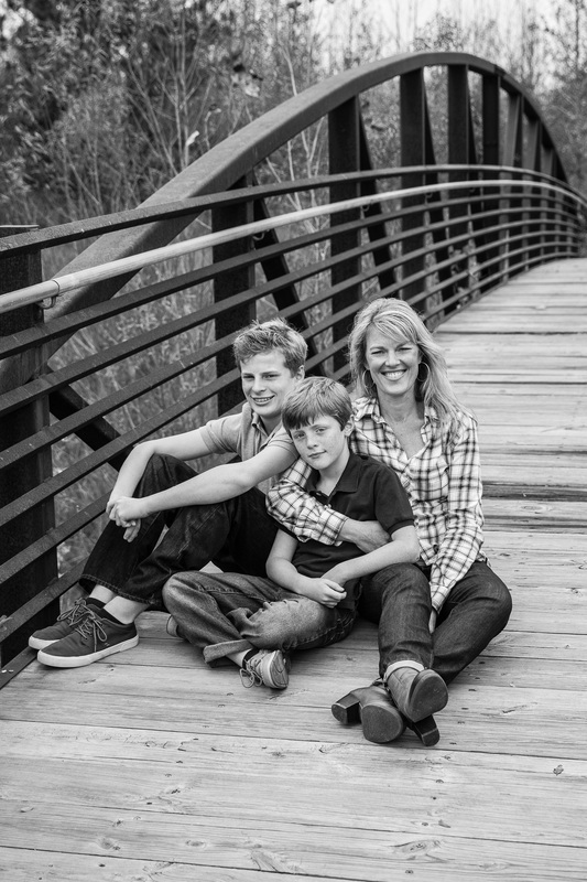
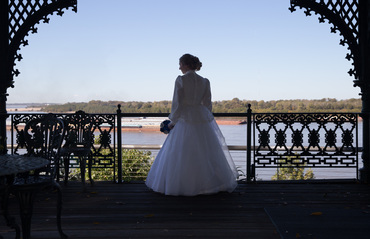
Back in February 2013, we featured a heart-warming child portrait by Tennessee based professional photographer, Laura Lee. She has been submitting various examples of her beautiful portraiture since then and we decided to take October 2014 and feature her work once again! We like how these images reveal the range of Laura's work. Great use of natural light and composition. Thank you again Laura for letting us appreciate your fine portrait work!
|
September 2014
Photography by
Pablo Amos
Dhaka, Bangladesh
|
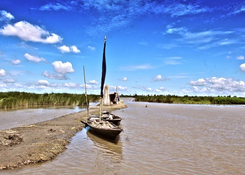
Pablo Amos composed this breathtaking photo during a recent visit to some riverine islands in the North-West part of his home country of Bangladesh. We love the deep azure color of the sky with the added bonus of the contrasting green reeds growing out of the water.
The simple boats moored at the shoal in the foreground serve as an important focal point. The viewer's eye connects the vertical of the small mast, as it intersects with the sandy shoal and the horizon line. Although it appears similar to an HDR photo, this image was merely processed in Photoshop without the special exposure effect. Our submission review team noted that the simplicity of the photo is what really makes this a winning photo. Excellent photo Pablo! Thank you for sharing with our international audience! |
August 2014
Photography by
Raunaq Saran
New York City, New York
|
|
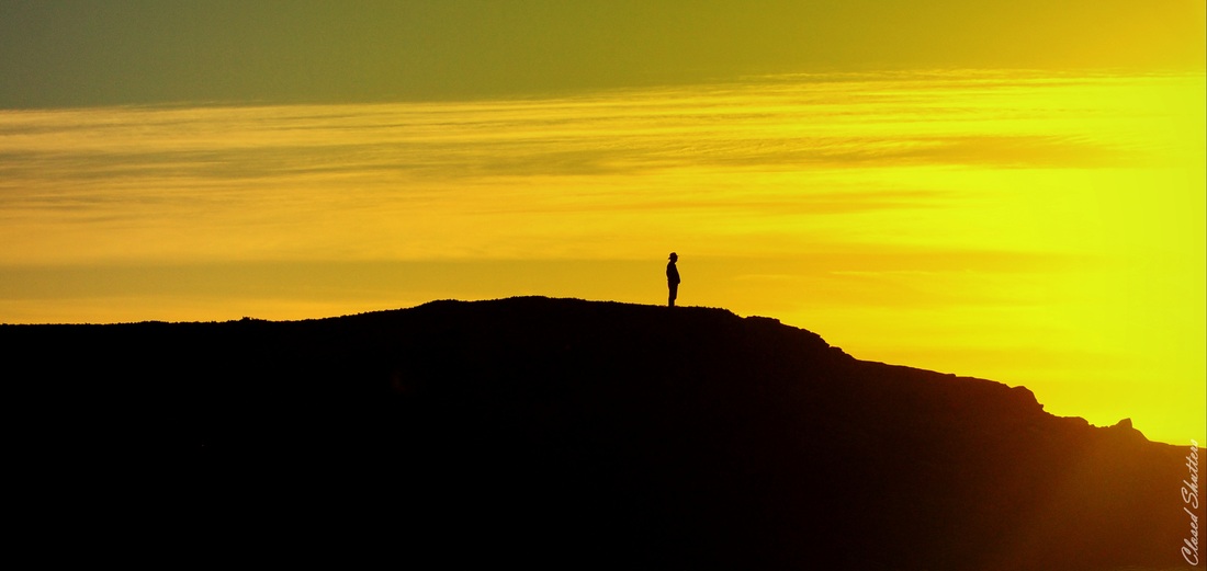
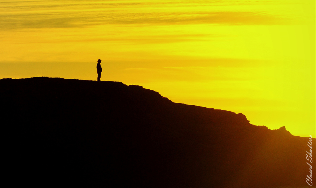
Although the composition of this photo is rather centered, the message is powerful. In photographic terms, we would normally want to leave more room in front of a subject's facing direction and less behind him or her. But in this case, the line that leads from the middle left draws the eye where it stops and rests with the unknown man on the hill. Interestingly, it's at about the same point where the hill begins to drop off and diminish. Our eye is then drawn to the bright yellow sun on the far right, thus completing the eye's journey around this most interesting image. Raunaq Saran said, most poetically, "This photo is a collection of unknowns. The man in the photo is unknown, what he is thinking is unknown, what he is looking at is unknown. I liked this mystery about this photo." We played with this photo and after nothing more than a simple crop, decided to publish both versions and let the reader decide which one is preferred. Formal composition conventions would suggest that the cropped picture on the bottom is a more correct and appealing version, in that the symmetry (both vertically and horizontally) are fixed. However, art is in the eye of the beholder and we might observe that BOTH versions have merit. Either way, Raunaq created an image with outstanding impact and drama! Excellent photography! |
July 2014
Photography by
Marlon Amaranto
Najmah, Saudi Arabia
|
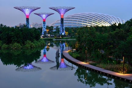
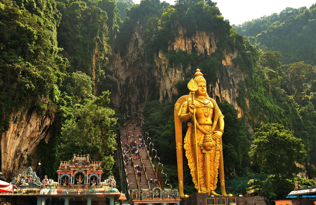
Marlon Amaranto, who resides in Saudi Arabia, took this breathtaking picture while he was visiting the Gardens by the Bay in Singapore. First of all, the setting itself is gorgeous, but what makes it a spectacular picture has much to do with what Marlon did with his camera. He told us that he snapped this shot with his Nikon D800, an amazing camera that breaks the megapixel barrier with an astounding 36MP of resolution! This image has superfine detail and keeps the colors true.
Marlon used a long exposure of 1/8 of a second and took this photo just after sunset. You can still see the faint blue in the sky and as reflected in the water. Despite the high ISO, his camera produced relatively little 'noise'. From a composition standpoint, this photo has it all! A wonderful leading line is created by the curved boardwalk. Look at how the gengle curve in the dome at the top right echoes the curved boardwalk. We have further echoing as the water reflects what's in the background. Thank you for sharing this excellent photo Marlon! |
You're looking at a statue of Lord Murugan; this one is the world's tallest statue of him, standing at 140 feet. This Hindu God of War guards Malaysia's most sacred Hindu Temple and Shrine. To the left and behind the statue are 272 steps to the Batu Caves. The caves offer a series of different temples and rooms. This site draws religious pilgrims and tourists, offering stunning views inside and out.
Marlon composed the picture smartly, putting the statue slightly toward the right, with the triangular hilltop providing a majestic frame around Lord Murugan. There is a slight haze hear the top of the picture, but it is not caused by the sun. Rather, it is a bit of haze or fog in the air, which adds to the spiritual feel. One can gaze at this picture, imagining how impressive it must be in person! On a non-photographic note, the stairs are frequented by monkeys which are not entirely friendly! Tour guides and locals who know the site most often warn pilgrims and tourists to avoid eye contact with the monkeys, lest the monkey may perceive it as a challenge; and a nasty attack might well be the response! |
June 2014
Photography by
Lee Lobban
Brisbane, Queensland, Australia
At first glance, the two images above appear to be pen and ink sketches. However, click on each one and you'll see in the enlarged version that they are stylized photographs. Lee Lobban of Brisbane, Australia photographed these old fishing boats, then used Photoshop Lightroom to apply enhancements to the contrast as well as certain filters that rendered the dramatic effect seen in these images.
Our Submissions Review Team had a tough time sorting through about 60 images that were emailed to us during the month of June. But what stood out about Lee's submissions was the COMBINATION of the special effect, the subject matter and the composition. In other words, as Nathan Anderson from our Review Team said, "We see tons of Photoshopped and overly stylized photo submissions all the time, but that in itself, does not make for an attractive or even an interesting photo. It can and most often is overdone, and the worst part is that there is usually no reason to ruin a good photograph by going over the top with filters. However in this particular case, Mr. Lobban applied the enhancements and filters with very good purpose! The historical content and style of photography is most definitely suitable for this particular effect; the effect dramatizes the scene and reminds the viewer of something from an old storybook! Very, very well done!"
So, we were obviously impressed with these photo works. Lee also had a philosophical take on his work and his approach to it. "(Old) boats or buildings are good subjects for the photographer because they are not just photogenic, they tell a story. That is what drives my interest in this particular genre. I feel the same about portraiture: give me an old lined face any day." We couldn't have said it better! Excellent photography Lee!
May 2014
Photography by
Russell Doherty
Austin, Texas
During the month of May, we received over 50 submissions from visitors to our site. Some were from camera novices, while others really stood out in the pack. We chose to feature Russell Doherty's photography and displayed both of his submissions.
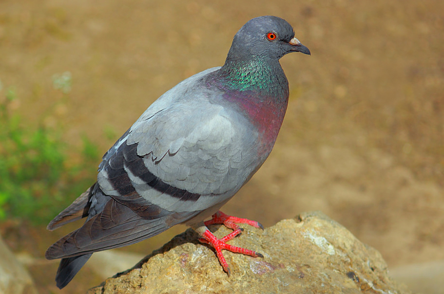
Starting with the picture on the left, Russell did everything right! His camera technique was spot-on; perfect focus, ideal exposure, excellent tonal range and contrast, and beautifully applied short depth of field. His composition was equally attractive, framing the bird in classic positioning. Although it is a photo of a common pigeon, it is an excellent example of animal photography.
Russell's second photo shows his range as as photographer. Bounded by a partial 'natural frame' with the trees on the left, the viewer's eye follows a leading line from the wake in the water to the blue canoe. The shapes in the skyline and the old bridge provide a geometric feel that makes the image look orderly and sharp. Russell told us that he feels that this picture is a good representation of urban living and we can't agree more. Bravo on some excellent photography!
April 2014
We recognized two contributing photographers for the month of April
|
Photography by
June Farby Los Angeles, California June Farby told us that when her family got together following mass on Good Friday, they participated in her family's long-standing tradition of having a fish fry and, later, coloring Easter eggs. However, this year she remembered to capture a bit of it on camera.
This is a delightful image that's sure to bring back bright and bubbly memories for anyone who, as a child, enjoyed dipping eggs in food coloring just prior to Easter! What we like most about this particular photo is the saturation and range of color tones. The short depth of field is also a plus. It's derived from the relatively wide aperture at an f/4.5, and it provides a focal point directly in the front row, with the focus dropping off quickly within just an inch or so. Nice work June and thanks for the memories! |
Photography by
Melanie Schwitzer Toronto, Canada When Melanie Schwitzer and her husband went on a romantic weekend getaway in late April, her camera and photo gear were by her side the whole time. Melanie said in her email submission to us, "Romance is important, but photography is still going to happen!"
Melanie and hubby left Toronto for Port Stanley, Ontario, where they spent the weekend eating yummy meals, holding hands on strolls through the town and perusing the many specialty stores and antique shops in the area. Melanie spotted this vintage window frame leaning against the outside wall of an antique shop. Was it from an old church? Maybe an old farm house? Whatever the origin, the top of the window has a unique design that is showcased nicely by the rustic wall behind it. The shadow adds another layer of visual interest. Nice photo find Melanie. (...and did you buy it too??) |
March 2014
Photography by
Michelle Farmer
Auckland, New Zealand
|
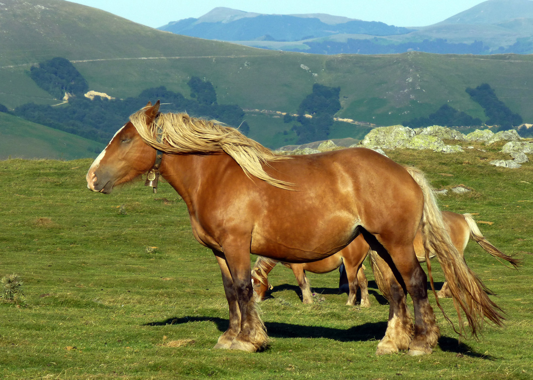
What a majestic pose struck by this horse! Although she submitted this photo in March, 2014, Michelle Farmer originally snapped this photo in August 2013 while traveling in Pyrenees, France. The lush green landscape, with the mountain range rising in the background is such a beautiful setting for this lovely photo. There's something peaceful about this and the context seems perfect for the horse's stately appearance. We like how Michelle caught the horse's long mane blowing in the breeze. This photo is also notable for the way that a yellow hue washes the entire photo, nicely matching the golden accents in the equine subject. Michelle captured this photo using a Lumix (Panasonic) DMC-TZ30 point-and-shoot camera. Not wanting to sound like an ad, but we were impressed with the surprisingly good quality for a camera in this class. Thank you, Michelle, for sharing this tranquil scene! |
February 2014
Photography by
Ted Sommers
Sedro Wolley, Washington, USA
|
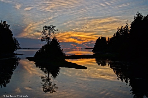
Ted Sommers got his camera snapping at dusk and used the gorgeous Drayton Harbor, Washington area as a willing landscape to showcase a sunset. So, why did our Submissions Review Team select Ted's photo to feature from all of our February 2014 entries?
First of all, we were particularly taken with Ted's very effective use of silhouette. Notice how the trees are a fully saturated black, striking a sharp contrast to the vibrant colors in the sky? This helps to define various basic shapes that pique the viewer's interest. The silhouettes also says to the eye, "The stuff in the foreground is there merely to bow to the majesty of God's sunset!" We also love how the soft, rhythmic patterns of clouds are reflected gently in the water. The composition is also perfect; not completely symmetrical, with the balance favoring slightly toward the right. There is ample negative space (nothing going on) which gives the eye a rest and avoids clutter. |
Ted shot this stunning picture with a Sony SLT-A57. It's a fixed-mirror interchangeable lens camera that, from the look of his work, performs brilliantly! This is beautiful work that is worthy of being enlarged, matted professionally behind glass and hung prominently on a wall. We think that our visitors will also agree and will be thankful that Ted chose to share his photo artwork!
January 2014
Photography by
Jai Adam Thorpe
Hobart, Tasmania
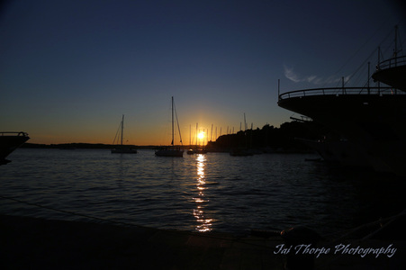
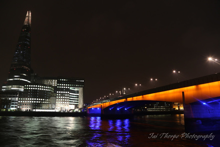
Jai Thorpe calls Hobart, Tasmania home, but he did some striking photo work while in the UK and Croatia, and we are more than pleased to share his photo accomplishments with our readers! What a nice way to start-off 2014, especially considering that much of the northern hemisphere has been dealt a wintry blow that seems very hard to shake. Jai's dusk and evening images prove that without proper technique, composition does not carry a picture too far. In these cases, Jai's photography boasts outstanding attention to detail and perfect exposure!
The first image, above on the left, is beautifully focused, with nice clarity in the silhouetted boat hulls to the right, continuing with sharp edges throughout and toward the background, where the sailboat masts puncture the setting sun. It's easy to write artistically when the imagery is so aesthetic to begin with! Jai tells us that, "I was in Hvar Croatia on a walking tour which was just finishing I could see the beautiful sunset coming and was eager for the tour to end so I could capture it, as it finished I ran over to the wharf and set up with my tripod in front of a million dollar scene, so I quickly put my polarised filter on and started snapping."
Jai's window of opportunity was short, but he managed to get the shot. Such a better idea to use a circular polarizing filter than to play with it too much in processing. We applaud Jai for avoiding the temptation to over-do the colors in his sunset. Many photographers these days have learned to rely so heavily on Photoshop processing that they go beyond basic crops and adjustments, and mess with the hues to the point at which the image looks more like utter fantasy rather than what it should be; an artistic , interesting and attractive expression of reality. Good call on this one Jai!
I
The second image, taken in London, shows the deeply saturated colors under the London Bridge as it curves toward the Tower Shard. While he did not share his metadata with us, it's obvious that Jai used a tripod, a relatively high # f/stop (small aperture), low ISO and a long-ish shutter speed to get this effect. We would pick the small aperture because everything in the photo is equally focused, which indicates long depth of field. He would need a high number f/stop (or a very tiny lens diameter) in order to get this effect. The picture has very little 'noise' or grain, so we assume he used a low ISO sensitivity. Finally, a longer-than-normal shutter speed would be a must to get a proper exposure, but not so long that the distinct waves blur into a smudge.
Great photo work Jai. Enjoy the Contributors' Gallery Achievement Certificate that we've sent your way!
Have a photo you want to show-off to the world?
Use our Electronic Submission Form
Send us your "best of the best" and if it's good enough, we'll post it for the world to see!
If our Submissions Team decides to post your image here it means something special is going on with your photography. You have the pride of knowing that your photography is at a higher level. Best of all, you can show your posted work to friends and family - you can also put-up a link to this page up on your Facebook, Flickr or other sharing site!
Contributors with a photographic work that is accepted and posted here will receive a special certificate by e-mail.
In a way, it's a bit like winning a photo contest where your work can be seen by the world!
Currently accepting photo submissions for our regular monthly 2016 photo gallery.
(Submission Limit: Maximum 2 pictures per month)
LINKS:
HOME PHOTO TIPS INDEX FULL COURSE INDEX "HOW TO" INDEX PHOTO FORUM
SITE SEARCH CONTRIBUTOR'S GALLERY FREE DIGITAL IMAGES CAMERA & GEAR STORE
GREAT CITIES EXPOSED SERIES TOP PHOTOGRAPHER PROFILES PHOTOGRAPHY RESOURCES
All rights reserved. Reproduction, storage, copying, publishing, manipulation, digitizing or selling of any of the text or photos on this website is strictly prohibited. Under no circumstances shall any part of the content on this website be plagiarized or referenced as the work of an author or photographer. Re-selling of any of the content on this site is strictly prohibited.
Browse, learn, purchase and explore with confidence.
Certified virus-free, malware-free, spyware-free, scam-free and spam-free.
Associate-Sponsor Disclosure Content Download & Terms of Use Privacy Policy Contributor's Gallery Terms of Use Forum Terms of Use
Certified virus-free, malware-free, spyware-free, scam-free and spam-free.
Associate-Sponsor Disclosure Content Download & Terms of Use Privacy Policy Contributor's Gallery Terms of Use Forum Terms of Use

