Professional Photography
|
|
Photo Composition Tip #4
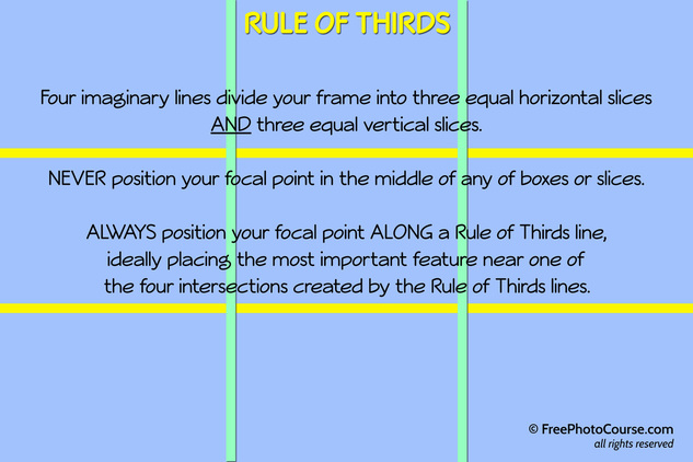
The Rule of Thirds Article by Nathan Anderson, Staff Writer (selected photos by Stephen Kristof, Staff Writer/Photographer) © 2012, FreePhotoCourse.com; all rights reserved You can't get through a fine arts class without learning about the Rule of Thirds. The same is true for photography. It's one of those fundamental laws that applies to any genre of visual art, from drawing to painting to photography. And it also happens to be one of the most important aspects of photographic composition. What is it? Keep reading. Here's a good simple definition of Rule of Thirds: The Rule of Thirds is a photographic composition guide that helps the photographer decide where to put the focal point and how to arrange other content in the frame. Here's a more advanced definition of Rule of Thirds: The Rule of Thirds is a convention of photographic composition that uses imaginary lines to divide the picture frame into three equal vertical and horizontal slices. Important elements should be placed along the dividing lines rather than in the middle of the slices. The most important part of the photo, the focal point, should reside on or near one of the four intersections created by the lines. It sounds reasonable enough, but trying to put these definitions into practice when holding your camera is quite another thing! I remember learning about the Rule of Thirds when I was in my first year of college. At the time, it seemed like just another stupid rule that would sap my creativity. Thankfully my understanding of photography and of the world around me has matured some. (Please don't ask my wife about the maturity thing...!) Now I realize that the Rule of Thirds is so crucial to almost every photograph I compose, that were I to disregard it, I would produce works that were not even remotely artistic or attractive. So, how does it work? Let's begin with the diagram below. It illustrates how the imaginary lines seperate the frame into three equal vertical parts and three equal horizontal parts: |
|
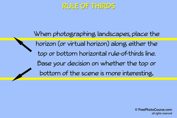
Imagine that the yellow lines shown in the frame above divide the picture into three equal slices from the top to the bottom and that the green lines also separate the picture into three equal slices from the left to the right. Important elements of your photo should never be places inside the middle of any of these slices. Instead, they should reside along a yellow or green line. One of the easiest ways to understand this is in the use of the horizon line in landscape photos. The horizon is a very important element in a landscape image where the horizon (or a virtual horizon) is visible. While it is NOT a focal point (ie. it's not the most important part of the picture), it is still very important.
As seen in the image below, this beautiful sunset photo opportunity was not fully or artistically engaged because the photographer chose to put the horizon line along the middle of a horizontal slice. Not only should the middle of a slice have been avoided, but the middle of the middle slice was the worst place to put the horizon because it tends to cut the picture into two. The symmetry created by this is unappealing to the eye. As bad a decision as that was, the photographer also chose to place the focal point (the sun and its reflection) in the center of the middle vertical Rule of Thirds strip. Everything is centered, cutting the picture in two.
The viewer wonders subconsciuosly, "Where should I look? At the top or the bottom? What is the main idea of this picture?" Confused and bored, the viewer quickly moves on to the next picture.
|
Improving this picture is a simple matter. Merely move your camera to the left a bit (it could be to the left or to the right, depending on what's going on in the sky or on the water. In this case it's identical, so the default is to move it to the left slightly because we tend to see things from the left toward the right - the way we read - so this gives an implied forward motion.) Then tilt your camera upward a bit so that the horizon sits on the top third line as shown here. |
|
At the risk of boring you with the same scene again, there's another important lesson to be learned here. Now that you understand how important it is to avoid slicing your picture into equal top and bottom pieces (or into two left and right pieces), it's time to explore the criteria you should use to make your decision. Taken just a few minutes later on the same beach, the sunset changes dramatically, revealing other things that should take center stage.
Our photographer, Stephen Kristof, decided to show you two different views to see which one you prefer. The picture below on the left is an attractive image that makes the most of the surf on the sand and the reflection of the setting sun. The warm red and yellow glow of dusk is apparent and promotes the overall feel. It's not much different from the picture above, but it allows us to demonstrate a crucial point. As attractive as this is, one might wonder if another attractive - perhaps even more attractive - picture exists somewhere else in this scene?
Click the picture below to see what's missing.
So it's imporant that you examine the entire scene in front of you and ask yourself what is the most interesting and important part of what you see? When applying the rule of thirds, think about how your decision will impact the what is and WHAT SHOULD BE revealed.
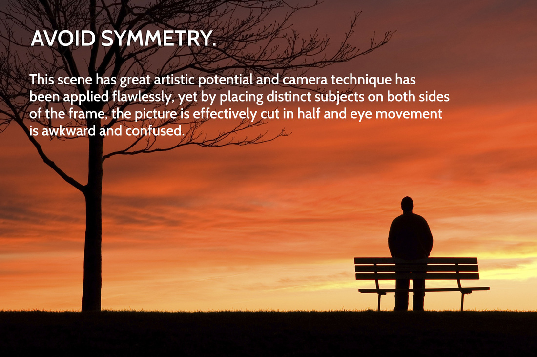
The first part of our understanding of the rule of thirds deals with symmetry. Symmetry is generally a bad thing in photography. Avoid putting two focal points in your frame and you avoid symmetry. If you have a highly noticeable element of content in your frame in addition to your focal point, then you need to adjust your position or angle so that you don't cut the picture in half. The picture below on the left has the hallmarks of a photo that could wow. The warm tones, jet-black silhouettes and simplicity are amazing. However, it doesn't hit the mark because of poor composition. Rule of Thirds theory was not followed and the eye is static and bored.
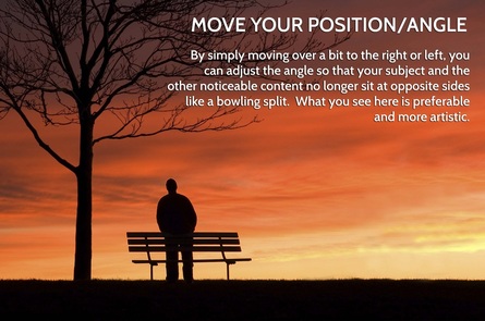
By moving over to the right, the photographer changes the implied distance between the person and the tree, resulting in a far improved composition. The picture above on the left has formal balance (symmetry) which is unappealing. The picture on the right is an example of informal balance which engages the eye and imagination far more effectively. As well, the tree now frames the person; another positive aspect of composition. With this improvement, the tree is no longer incidental and does not divert attention away from the person. The tree now has a purpose in the picture.
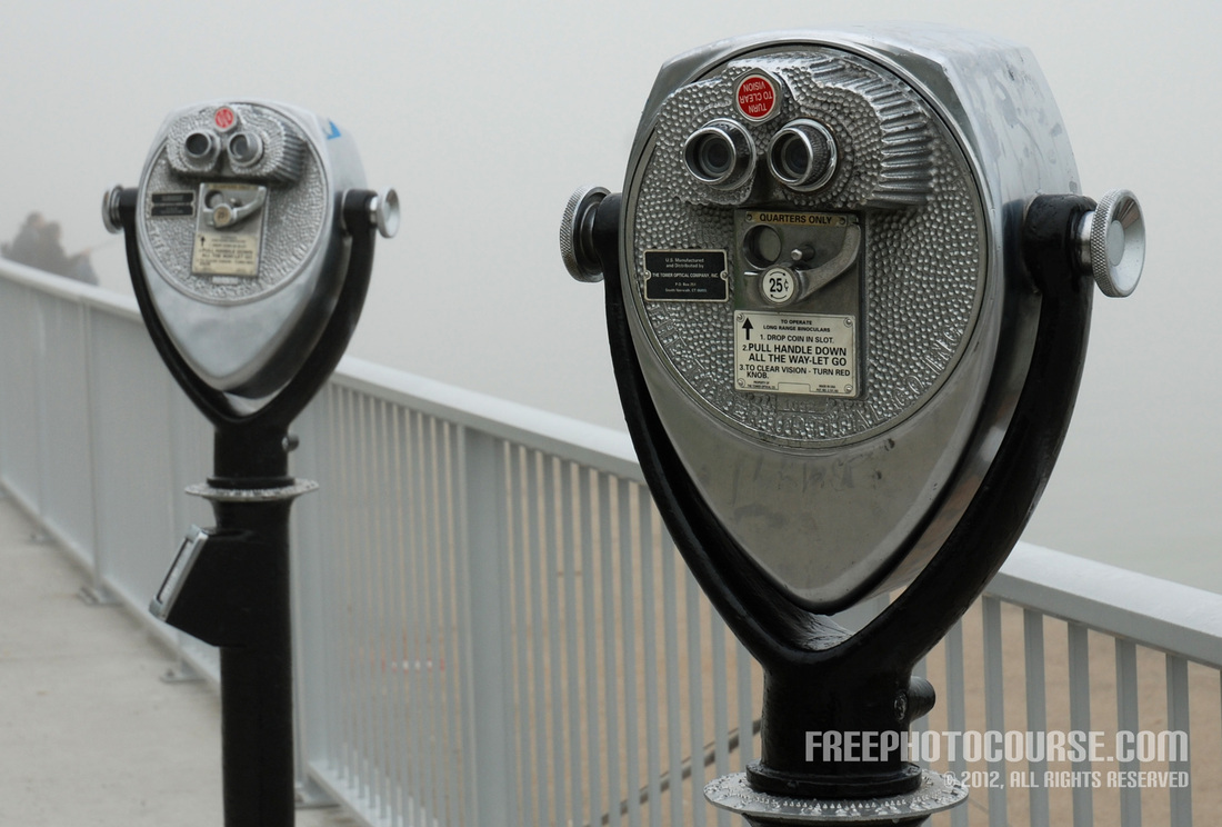
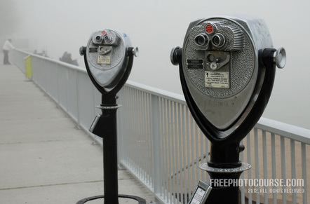
The next set of pictures illustrates the same principal. Despite the fact that the perspective is interesting (it shows some depth because the coin operated binocular to the left appears somewhat blurred and smaller), the largely symmetrical composition is unflattering. The second picture to the right changes the position slightly and zooms-out to a wider perspective, allowing a somewhat unbalanced composition which is more engaging and interesting. As well, the fence and sidewalk appear to eventually converge which moves the eye around the frame playfully.
The next set of pictures illustrates the same principal. Despite the fact that the perspective is interesting (it shows some depth because the coin operated binocular to the left appears somewhat blurred and smaller), the largely symmetrical composition is unflattering. The second picture to the right changes the position slightly and zooms-out to a wider perspective, allowing a somewhat unbalanced composition which is more engaging and interesting. As well, the fence and sidewalk appear to eventually converge which moves the eye around the frame playfully.
In this third example of the same subject matter shown below, our photographer chose to illustrate two composition concepts to create an even more interesting and artistic work. As discussed in our third composition tutorial on Photographic Simplicity, a decision was made to focus the attention on a single coin-operated binocular which seems to have a greater overall visual impact. The Rule of Thirds is obeyed, leaving a bit more room on the right than on the left; the main 'face' of the binocular sitting over the top right intersection of the imaginary lines. The binocular appears to be facing toward our right and, accordingly, more negative space (or room) is provided on the right than on the left of the frame. The 'eyes' of the binocular face sit close to the top horizontal Rule of Thirds line; where they should be.
There's much more to learn about the Rule of Thirds in photo composition and I'll be exploring that in my next tutorial, called The Rule of Thirds - The Importance of Lines and Intersections.
PREVIOUS PHOTO COMPOSITION TUTORIAL NEXT PHOTO COMPOSITION TUTORIAL
PREVIOUS PHOTO COMPOSITION TUTORIAL NEXT PHOTO COMPOSITION TUTORIAL
So, the bottom line of this article/tutorial?
Always follow the Rule-of-Thirds for aesthetically pleasing photographic composition!
Check back for more Photo Composition Tips and Tutorials,
because we'll be adding more on a regular basis!
LINKS:
HOME PHOTO TIPS INDEX FULL COURSE INDEX "HOW TO" INDEX PHOTO FORUM GREAT CITIES EXPOSED
SITE SEARCH CONTRIBUTOR'S GALLERY COMPOSITION TUTORIALS PHOTO LINKS FREE DIGITAL IMAGES
© FreePhotoCourse.com. All rights reserved. Reproduction, storage, copying, publishing, manipulation, digitizing or selling of any of the text or photos on this website is strictly prohibited. Under no circumstances shall any part of the content on this website be plagiarized or referenced as the work of an author or photographer. Re-selling of any of the content on this site is strictly prohibited. The lessons on this website were provided free of charge for individual home users; if you paid for any of this you have been cheated. Please report any misuse, sale or plagiarism of this material here OR E-MAIL US AT: CONTACT@FREEPHOTOCOURSE.COM
Browse, learn, purchase and explore with confidence.
Certified virus-free, malware-free, spyware-free, scam-free and spam-free.
Certified virus-free, malware-free, spyware-free, scam-free and spam-free.


